
Here I am going to collate some related campaigns from other organisations so that I can compare them, analysing what they do that works and what their weaknesses are – considering both design and what they portray.
Northern Ireland Chest Heart & Stroke
The first I looked at was Northern Ireland Chest Heart & Stroke, despite still . being a reasonably small campaign it was still the biggest I could find, and also one of the few that branches across multiple mediums. Furthermore it portrays the link between the stroke and AF which few show and is particularly important to this.
The biggest strength to this video is its production value, it has been created by a trained animator and looks very well done. In the context of our brief I feel a video like this would be too long, it was made for the purpose of someone specifically seeking out the information. If I was to create any moving image content I would likely keep it to a minimal advertising length. Where possible across all of my designs I would like to abstract the visuals slightly so that they avoid cliches of just medical looking diagrams, I would like to avoid that aesthetic where possible and keep it reasonably lighthearted.

These two posters are clearly created for two separate purposes, one for advertising and then the other that is informative. This is something that is still worth considering as sometimes there is a time and place for informative posters such as in GP surgeries and hospitals, something that does not need to be as attention grabbing and can be referenced easily. The poster is instantly recognisable of what it is about because of the vibrant red and the heart rhythm diagram, the method of advertising could be slightly more out there and use a catchier motive that an audience will remember. Trying to find a way that avoids these design and colour cliches will be a goal.

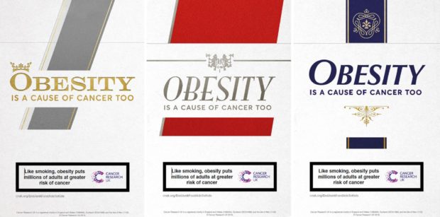
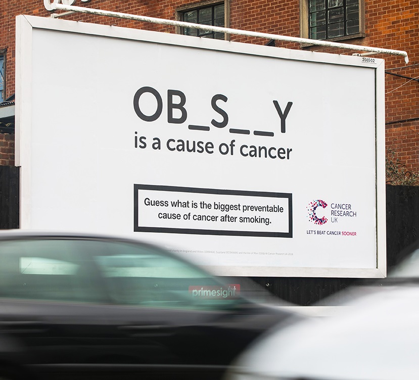
Obesity Campaign Cancer Research
A campaign that I feel really did not follow stereotypes for medical campaign design was Cancer Research’s Obesity campaign. It did everything that previously mentioned campaigns didn’t do using provocative design that inspires brain interaction to gently decipher what the message is without being able to be misinterpreted. They proved that this kind of design could be more than friendly and can be deeply persuasive in this context and they even kept it pretty minimal. I don’t think this is the project to be quite as on the nose as that but I would like to try break out of the tradition you currently see.
AF Association
When searching into organisations that deal with AF one of the main ones i came across was the AFA. As part of one of their campaigns this was their printed poster. The slogan and imagery are actually pretty powerful at putting across the message and it really does make you question yourself. However it does slightly miss the mark in further information, I think some nod to why it could save your life would take the design further along with possibly some stronger typography. There is a fine balance between too much information and not enough, and this is a reminder that with not enough the viewer could be left none the wiser to what it is trying to say.
.jpg)
