
Since saying that I was done until the critique, I have since found some time to add another pages, hopefully this should open myself up to more expansive feedback.
It may also be clear now that I have a system of switching between both black and white pages within this chapter, there is no set reason for why each is its set colour other than what fits the aestetic most. For this pages for example it did not have the same impact on black and felt lost. The design of this page is to replicate the aspect ratio of a phone, without being overly explicit and adding the phone itself. The text itself is about how content adapted to the shapes and sizes of the new wave of devices so I have tried to give suggestion of shifting size, this could be more experimental I feel.
Of the pages created so far, this spread works the least succesfully. It fits the visual feel well enough but just doesn’t add much to the conversation, this is another that I feel could be revisited. With the page being about inclusivity I feel there would be room to make it a stand out page, perhaps with heavy use of colour that would make it unique to the rest of the chapter, suggesting how brands will go out of their comfort zone if they have to, just be inclusive.
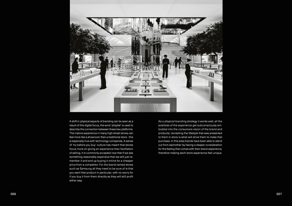
This spread discusses the change in how physical stores work no that they have their digital link. As it made sense to use factual imagery on this page I chose to keep it simple and refined , with the layout drawing the most attention to the imagery. Having the picture in this position going full bleed at the top looks visually strong and I intend to replicate across the rest of the design when I am displaying pictures.
I had some rather big type in previous pages but for this one I opted for even bigger, this was to give a feel of the current state of the online influencer space. Youtube videos in particular are more sponsored than ever, with videos having mid-rolls within the video as well as standardised adverts. And in order to provide ‘full-disclosure’ on the views cast in the video they are likely accompanied with a #AD to cover this. Brands have been using influencers in recent years as a new form of advertising, instead of opting for set adverts they can get a whole army of people that are already loved to pedal a message, saving the brand creating any new relationships directly with the consumer.
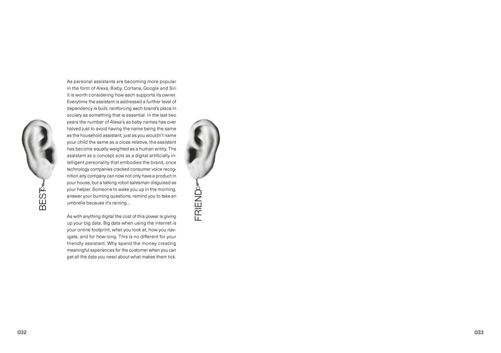
This felt like perhaps my most experimental of the pages created, I’m not quite sure what inspired me to create it in this way but I’m loving the fun appeal of it, even if it is simple. The spread itself is centered around how the ever present personal assistants that we use can be used to push a brand, so having the ears listening in felt like a fun metaphor.
Using these more experimental and light hearted jests could be a good avenue to follow in the editorial, as much as the serious and heavy vibe fits the time zone, I think there must be ways that both can be present so that the design feels more ‘me’.
