As a part of my final tweaks I decided upon a very last minute colour change to swap out the yellow for something slightly more forgiving. Now that this will not get printed before submission it made sense that I spruced up the colours into the RGB space, this meant that when adding the mockups to my portfiolio and website that they would fit alot better. I first changed the blue to something striking and digital feeling to match the narrative, after doing so I just couldn’t find a yellow that matched up to it, so I looked in the grey area and landed on this fresh blue. It changed the feel of the design alot but the areas that it worked the best are on the text pages, the digestable contrast has put much more empahsis on the type and the nice wingding forms, whereas before the colours stole the focus.
Back Cover
Inbetween design sessions I was considering how to handle the mockup as it did not fit any traditional formats. Ultimately I sided with using a similiar method to my draft mockup, simply because without being able to print I think I would struggle to create anything more complex. With the more delicate colours I feel that the mockup feels more refined anyway. A few tweaks from last time include adding a number to the lock, in the physical version this would be the code to open the lock, ultimately making the locking sytem purposely redundant as a jest towards the skeptics arguments. The name was simplified to just ‘leave’ as the previous name of ‘radical skepticism’ felt too academic for the almost romantacised style that I chose. The name leave comes from the first half of the narrative where there is a drive to leave and ‘finish’ the game at any cost, therefore the name of simply leave represents the skeptics influence.
The word leave is then also repeated below as a wingdings ‘translation’, this is here to give hint at the inside visual style while also alluding to what the text says towards the end of the book. Narrative is deciding with staying or leaving, the use of the wingdings here is to show the skeptic trying their hardest to make one last persuasion, but the antagonist has already made up their mind, blocking out the skeptic as gibberish.
As a print design project I am happy with how it came out, I think the colours were a good change that has made the project feel more realised as an idea, showing that last bit of refinement that works well amongst my portfolio. As expansion to the project I still intend to create it as a physical object that can be photographed for real, this will however likely be outside of submission. When applying for jobs in the near future I may consider using 3D modeling to make an alternative mockup.
For the final element of my D&AD submission I just had to create the four accompanying imagest that go along with my video entry. The purpose of these is to go in depth on aspects that were glazed over in the video, and it is also an opportunity to expand on the 100 word limit that you get at the top of the submission. Because I already had all the images and assets available from the video the construction was an easy process, I did however have to be mindful to stick within my campaigns visual style, this would help the submission feel more of a cohesive idea. Using the my recent visual additions to my video I used the gradients to full effect as the backgrounds, having a different one on each, pushing this idea of variety of Unexpected books.
The ordering of the images is quite important as they almost act like a slide show of telling the idea in stages. My first slide is intended to show the core concept of how these books interact with the environment, I did originally have one big image here but after David’s advise I changed it to multiple to show further scope and it works much better at presenting the idea. In the same way that I lamented over the script for my voiceover I also was particular each paragraph here, making sure that each was simple and clear about the idea, cementing that it cannot be misunderstood.
The Unexpected Bookshelves project turns any city into the bookshelf of the new age by giving audiobooks a physical form to stumble across on our everyday travels. The project builds audio books into our daily routine, giving anyone the tools to make the most out of their freetime wherever they are.
The second slide shows how the interaction process with the physical book works, breaking the concept down into its three key parts and using clear imagery to get it across.
Unexpected Bookshelves revolves around a simple idea: you find an Unexpected Book in your environment, pick a title from the Audible library and claim it as part of your 30-day free trial. Once finished, you then return the favour by leaving a recommendation and placing the book somewhere for the next person to find. Wherever the book is placed an Unexpected Bookshelf is formed, giving communities the opportunity to be creative and see their city in a new light.
Foreshadowed by the phone on the previous slide, this page shows the inner book process of claiming a book through the Audible trial. It is in this section and the next that I give further detail into the idea of leaving specific recommendations for the next user to find.
Once you have found an Unexpected Book the claiming process is made simple using a Near Field Communication (NFC) tag on the inside of the book, removing the need for any navigation to the claiming site or any additional hardware, all you need is your phone. When the page is first loaded up the user is presented with the book that has been left for them by the previous user, you then have the choice to take that person’s recommendation or choose a book of their own from the Audible library, and claim it with the 30-day free trial. Next you can choose a title to recommend for the next person that finds the Unexpected Book, with suggestions celebrating ties to local authors to the area; the project is further ingrained into its environment.
The final slide is used as a way to explain how the campaign works in a wider context, taking some visuals from the video I played further into the idea of recommendations changing based on location. I also mentioned how social media would play a part in the process, I could have gone into more detail on this point but I felt that alot of it is self explanatory, it doesn’t take much to imagine how it would help the campaign so I did not want to waste space.
The Unexpected bookshelves project not only adapts, but also interacts with the local culture of the city that you are in. The default book recommendations will highlight a location’s ties with celebrated local authors; this allows the project to exist when the books first arrive in a city, while also giving a pool of suggested authors to make recommendations from. The nature of the campaign would likely make it inherently suitable for social media sharing, opening the door for advertising a book’s location for followers to find, while spreading awareness of the project.
As the last element, I sent off my submission once they were done.
This project has grown alot on me as it has gone on, turning into without a doubt my favorite of my three years at university. The project has spanned over 6 months and that time has given me alot of time to tweak the core concept to be just how I wanted it. I think design wise it does its job but is not perfect by any means, this would be something I would put more time into given the chance to do it again. However the idea itself is what holds the value to me in this project and I think its something quite different. Producing the project in a competition type scenario has forced to be more critical about aspects such as the written elements, giving me some strong pieces for portfolio that should feel like a fully formed concept, something that is hopefully appealing ro potential employers.
In my last iteration I implemented the narrative looping at the end of the dissertation, with the narrative changing but repeating the first part of the dissertation. I feel that just simply repeating the dissertation in the same way doesn’t really make sense with what I am going for. To make it fall more in line with the message of seeing things in a new way I have gone through the text and removed anything that is suggestive of a skeptic argument, as if the viewer has no need for it now that they have no doubts in their reality.
The obvious way to remove text in this way would be to do a strike through or a thicker block out, but it feels like something that isn’t all that original as you see it in most ‘edgy’ editorials. To me it makes more sense to keep the suggestion of the text being there but make it feel like nonsense. I tried using a ROT-13 algorithm in order to shift each characters place in the alphabet (including unicode)by 13 places, the reason you shift by 13 typically for something like this is so that it is easy to change back as you simply shift it again by 13 to bring it back to normality. This form of encryption is purely to make words visually unintelligible, and it works. It turned my selected paragraphs in to complete unreadable nonsense but it just didn’t look all that interesting, more like sample text than an informed design choice.
I liked the concept but it just wasnt working, thinking on the same lines I found that if a typeface was simply changing characters into something visually abstracted you could create an interesting look while keeping it visually very difficult to read – the answer was wingdings.
Changing the parts that talk of the skeptic argument to wingdings made the message much clearer and seemed to complement the display typeface well. The feel also played into the slightly retro text adventure theme, replicating the same sort of symbols you would see when an image was loading, while not being explicit to that fact.
Another benefit of bringing in wingdings into the style was that I could bring them in earlier foreshadowing their appearance later on, allowing me to using them as a system to bring the character I wanted in the narrative pages. I think that the way I have currently used them could use alot of refinement as there isnt a clear system right now but I am happy with how they have been used to censor information.
Now that all the styles are formed and all the content is in place, all that is left to do is polish the design so the system is cohesive and work out the best way to mock it up for submission
With most of the content being written I was on the last stretch of the project all that was left was to give it a cover and conclude. In the cover process I also had to choose a title for my project. I could have gone for something along the lines of ‘the past,present and future’ of branding but it just didn’t fit the light hearted style that the project evolved into. I ultimately decided on the name ‘Nine Lives’ a name that is not inherantly obvious of its meaning, but within the context of brands being represented as cats in the book, a brand living nine lives is to rebrand and become disconnected from its origins. Afterall a cat that lives 9 lives is not that same cat that started out.
As an interesting twist to the name, Maria thought that I had got confused when writing Nine lives, insisting that I meant to say Seven Lives. I soon found out that strangely each country has its own lore for how many lives that a cat has. When researching into this I found a funny thread that jokes about this:
British cats traditionally have 9 lives, but recent government cut backs are rumoured to want reduce this to 7. This would then bring the UK in line with the proposed Euro-norm of 7 lives per cat based on parity among members states, where life sharing will operate between EU states. There are fears that Greece is unlikely to make this new target and there are already feline protest in Athens…
Despite being almost completely irrelevant to the project itself it was something I had to include in the opening pages as a disclaimer, I feel like this also does a good job at setting the tone.
As for my final content, this was something that I really struggled with. This project was always meant to be a personal challenge as writing and editorial is something that I hadn’t done much of. Comparatively to the other two chapters that are meant to set up for a big finish I think that the written content itself is weak for the last chapter. I had many grand ideas for predictions but I simply struggled to put them to paper. On reflection I feel that although I would have personally found it hard, I would of been better off writing the content in one block at the start of the design process instead of building on it incrementally. As it went on this caused more personal pressure on the end, while also giving the text fluctuating writing quality and cohesivness between breaks. This would also of meant I could plan the visual narrative in advance too, creating more direction in that. Depsite the content not being quite to the level I would want it I feel that the visual design has worked out well and that aspect has benefited from the slow evolution as the project went on; I certainly did not think it would be cat centric when starting the project, but I am glad it is.
With my target audience likely being designers I wanted the conclusion to be a gentle reminder of individuality within design, afterall the projects origins came from the distaste of homogeneity in corperate branding.
My goal for the project was to push the limits of what I find comfortable within my design skills in order to create something different. In terms of research ,understanding, and time spent this is by far my biggest undertaking on a project. I am personally proud of what I have accomplished and I have learnt so much about editorial design from all the critiques with tutors and peers. The project has acted as the perfect way to round off my education in graphic design, filling in my knowledge and the print shaped gap in my portfolio. As with a few of my other projects, the true way to finish this project will be to get it properly printed and this is something I intend to do when that is possible.
Despite not being able to properly exhibit the project for the degree show I did try to consider how that might of looked. I admitidly did use a fair bit of creative licsence in its scale but it still acts as an example of how I could use my visual style outside of the context of the book. In the actual exhibition I would likely go for the same approach of having a purely visual accompliment as all the information is held within the book itself.
Now that I have my feedback for my dissertation design I am now able to crack and get the rest of the construction finished with a better knowledge of where I am going. I was pleasantly suprised with the feedback that I got as it was much more positive towards what I already had than I expected; I thought I had a long way to go yet, but that was not the case. I considered the type that I had chosen to be a risk for usual approach to design that I take, but in the feedback it seemed that it made for a stand out feature; giving me alot more confidence in the decisions I made for this design. I was also told to continue with the narrative that goes along with the dissertation and in fact I should celebrate it more.
With the knowledge that I was heading in the right direction I continued with adding the rest of the content in the same style, expanding on the narrative as I went using the Exit story. The reason I chose this particular line of narrative is that its decisions can be interpreted to run parallel to the dissertation, in the story you reach the end of the path and then restart the story with the knowledge that you know in order to make different decisions. As I was planning the rest of the narrative pages, I found that the first time the story ends lines up exactly with the end of the dissertation, at first I thought this was going to be a problem as then I would have no content to separate my narrative pages. However using the theme of the story I then found that it made sense to restart the dissertation, and have the different path of narrative to go along side this.
In my feedback it was suggested that perhaps illustrations would be suitable to go along side the pages but now that I have expanded the idea and given the pages their own device through their structure I feel it makes sense for the it to stay text based as depicting the specific events feels overly explicit for not much gain, as they are not the real focus.
The structure of the narrative pages is meant to suggestive of a text based adventure game, this is why there is a consistent layout between pages. I do think there is more room however to add character within these pages while still keeping the structure consistent, this will be one of my next steps.
The narrative pages occur frequently at almost every 3 pages therefore it makes sense to focus the more experimental elements there and keep the text fairly linear, as part of the idea is that it should be perfectly readable in order inform the change of view by the end. This will also help steady the pace.
In my feedback it was also discussed how I could enhance the construction even further with the idea of locking the book away as if it was something the skeptic did not want you to see. Currently the idea of using a traditional lock suggests that you need an external object in order to access the book, but perhaps it would make more sense if all you needed was a piece of knowledge not an object. A simple solution to this would be to change the regular lock to a combination lock, allowing the combination to be suggested somewhere on the external of the book, encoded in somehow. An alternative to hiding the combination might be to make the code blatant, this would act as a jest toward the skeptics futile attempts at withholding the truth, something that is more in line with the message of the dissertation. In my first draft I threw together a digital depiction of what this might look like, with the covid situation it is looking likely I will have to do this for the outcome itself but I am currently considering what other options could be possible, perhaps 3D?
Of the three chapters the future has been the hardest and slowest to write so far, all of my previous points and opinions have come to a point and now I have the task of putting out more core message.When I started the book I thought I had a good idea of where it was going, but as I have covered more areas of branding I think that this chapter needs to be more generalised about branding as a whole than I had first thought, otherwise I feel that I will have earlier points that have no conclusion.
With the core of this chapter being about brands adapting their outward facing identity to fit the user I decided that using fur could be a less obvious way of depiciting this. The idea that in order for a cat(brand) to change its identity it would wear a fur coat over its own fur. With the opening text I wanted to illustrate the idea of the future being in flux and changeable depending on our actions, which I guess is the purpose of this book, to make designers consider where we came from and where we are going, and how they fit into that picture.
For the other two chapters I used a quote to illustrate the theme of the text, this time I instead chose this saying as it seems to fit my message perfectly. In the present text I explain that many of the choices that are made are not purposely bad there are just trying to do what they can with the current situation, and in the future this will still be the case. They don’t want things to go badly but they certainly could.
To change the flow slightly from the expectedly structured chapter pages I broke it up with the addition of a cookies checkpoint that you would find on any website, the purpose of this is to further illustrate how prominent these will be in the future as well as now. It does not currently but it will obstruct the text behind the stamp to show how sites are more worried about getting you to accept than actually reading their content.
This page is relatively explicit of the pages’ content compared to other pages but now that I am on my conclusion almost it makes sense to celebrate the message, brands will be making a massive shift to being out spoken and it will be bold, the aim is the page reflects that shift.
In the text I discuss the down side to this, the politics that are being paraded aren’t bespoke views at all and will just be what they think you want to hear based on the data they have gathered on you, hence the title of the spread hollowtics. The imagery is meant to be a dark replication of the previous spread using the same layout and aproximate shapes to make it feel like two sides of the coin.
After the heavy hitting last two spreads I chose to make this spread more minimal to break up the pace, going back to the idea at the start of the chapter I used the visuals of a cat changing its clothes. The imagery itself was difficult to source suprisingly so if I find any that fits better I may switch it out. I enjoy the way that it minimally interacts with the text but it still clearly does, I want to go back through and do some more small interactions like this.
The imagery on this page has quickly become one of my favourites, accurately illustrating the sense of humour that I hope for this book. The intended message is to illustrate the profiles that brands are building on us using the data that we feed them, with the image subsequently being only as accurate as what they can get their hands on.
As another link back to past of the book I have used the mice again to visually show how methods of drawing customes in are becoming more aggressive and on the nose. They mey be hiding behind algorithims but having to get up close and personal with our data is a massive change in tactics.
Now is a good time to assess the styling of the design thus far, as I don’t have any facilities at home to do a test print I have simply used an online mockup to test the design as generic book. Although it will not be able to give me a sesne of legibility, I can see how my content will interact with the crease of the books. As the end of term pressentation is approaching I did many of the spreads in order to use these depictions in my presentaion, I helped to sell the narrative of dillution by channging the background colour depending on the place in the book.
Before getting stuck into the past completely I took the opportunity to fill in gaps of the current narrative, as it has been written in multiple sessions it was abit jumpy and didn’t flow as well page to page.
While making these changes I found that I could use the chapter pages to add small summaries to give context to what I will be talking about to make it extra explicit, alleviating any confusion about the flow of the narrative. Since the text was fairly small and minimal before it gives the page more purpose than just a title.
Of the spreads suprisingly this took me the longest to complete, not because of it’s complexity to put together, but I just could not think of an idea to represent the essence of what branding was. I use the cat to represent brands but there is no narrative in just showing another cat. Knowing that I wanted it to play into my theme it struck me that if brands are the cats then we must be the mice, and after all branding is about drawing us in. Playing with the cheese stereotype I feel makes the message clear enough while appearing playful, my only worry is if it correctly portrays the relationship between brands and consumer in the past, perhaps this better fits the present.
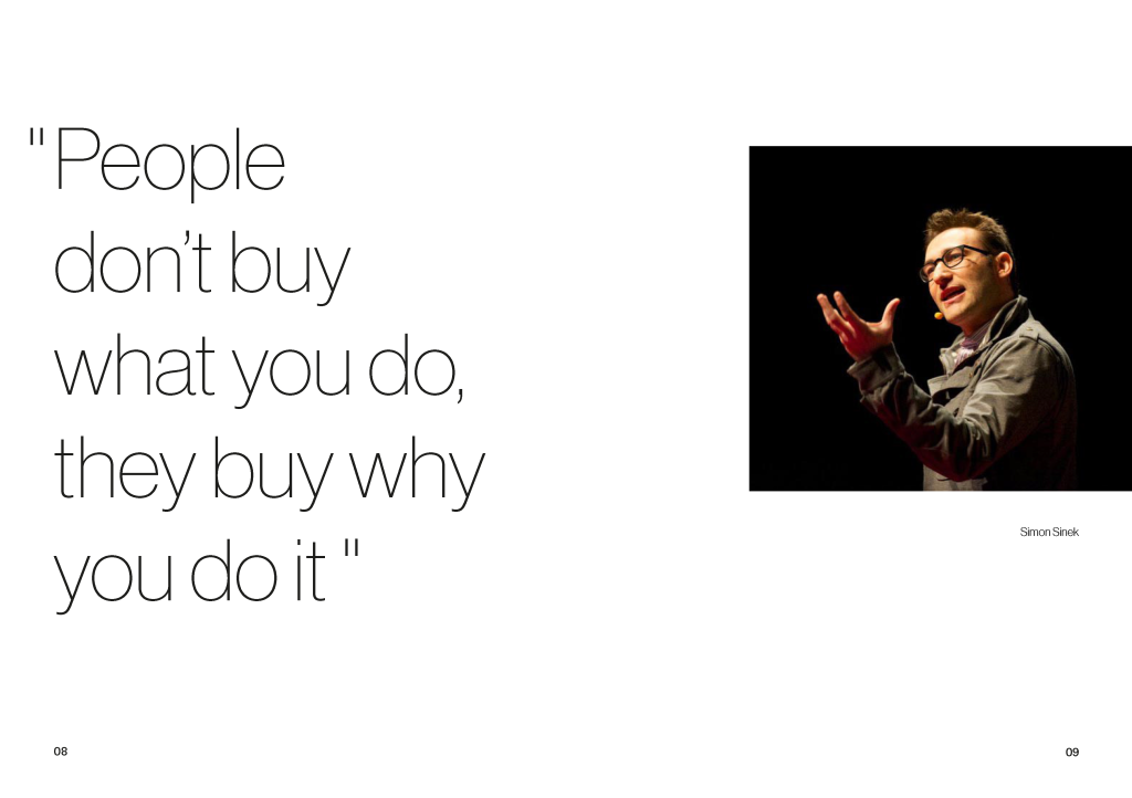
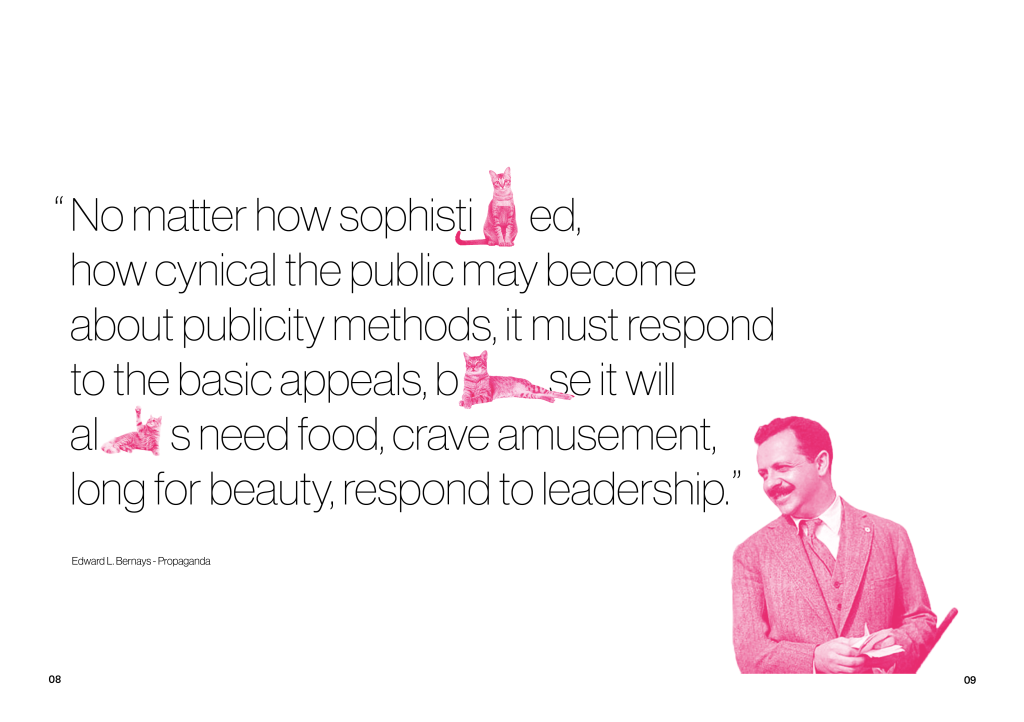
After recently discovering the work of Ed Bernays I felt it was so relevant to the evolution of branding that I had to write about it. In the first spread I explored more ways to be suggestive of the cats without throwing in fully body shots to give variety, using the paws coming up in this way has created one of my favorite spreads so far. On both of these spreads I have started to be more experimental with how I use my colour system, brining in the B&W tones from the present in order to illustrate negativity.
When writing the content itself I was torn on my feelings towards bernays, I cannot dispute the impact he had on branding as a revolutionary thinker, but much like many greats I find it had to endorse his own work. I find the reactions to his work in the industry to be much more important than the details of his rather questionably ethical campaigns. I therefore wanted to further illustrate this mental termoil in the page design, making it clear that I am not idolising him for his manipulation, but his consideration of consumer habits.
The last page of the past chapter serves as a short summary of ideas on the subject, to accompany the minimal text I chose to keep the rest of the page on the same tone. I took the opportunity to further use the colour scheme to represent the two times, the past transitioning into the future. By using a cat climbing into a paper bag I am also forshadowing the later page in which the cats have bags on their heads, further making it clear that there are meant to be cats under there.
For my present chapter I also found it necessary to have a conclusion of sorts in order to transition to the next chapter smoothly. The design comes from reffering to the brands as people following eachother on the ice in order to keep it from cracking, this comes brands being too scared to break the mould because of the ramifications. I chose not to take the imagery too far away from this idea and keep it true to what I am saying, it feels much more impactful this way and a fitting ‘dark’ end to the chapter.
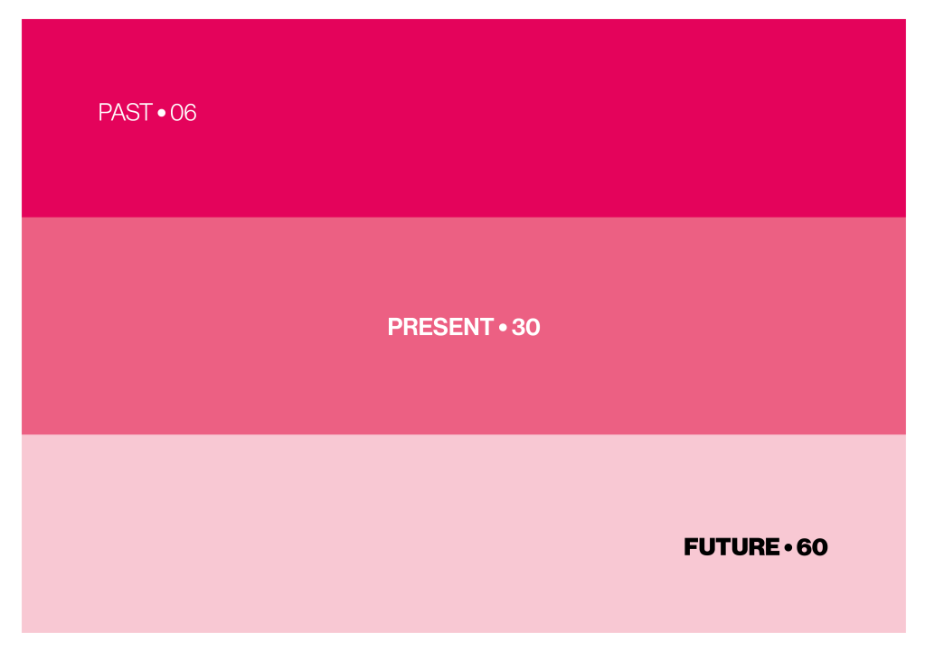
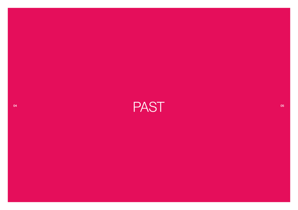
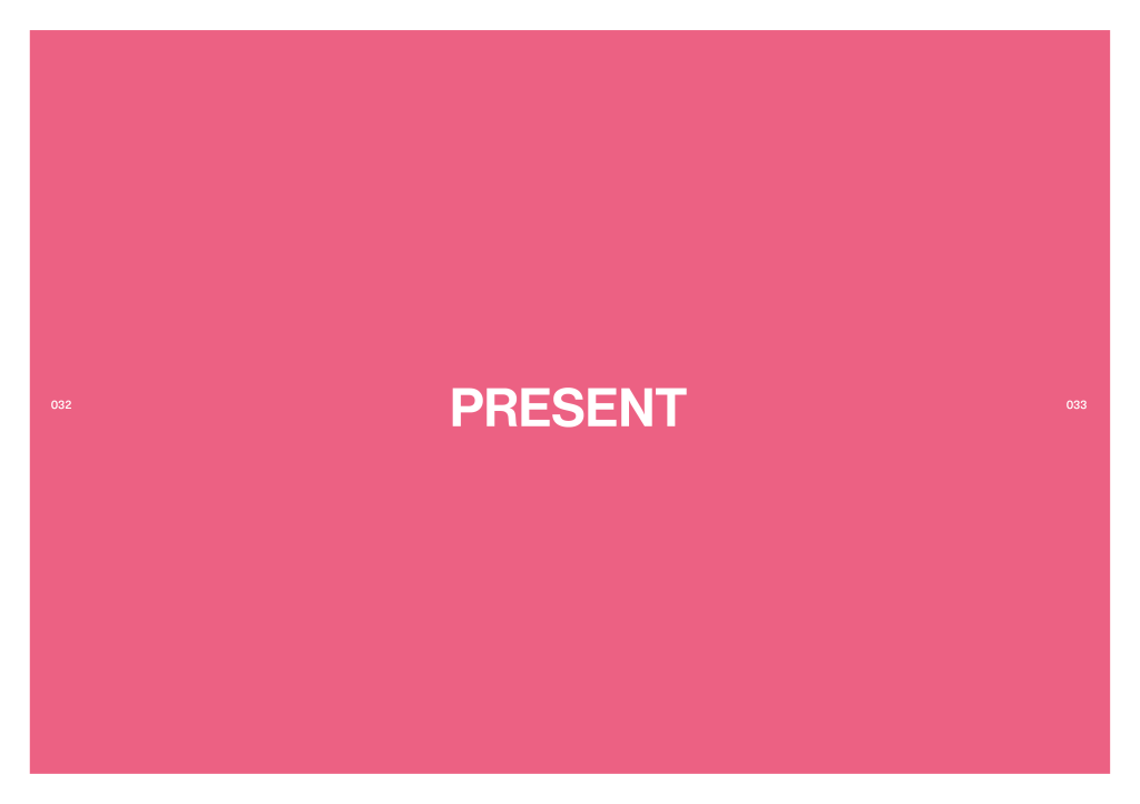
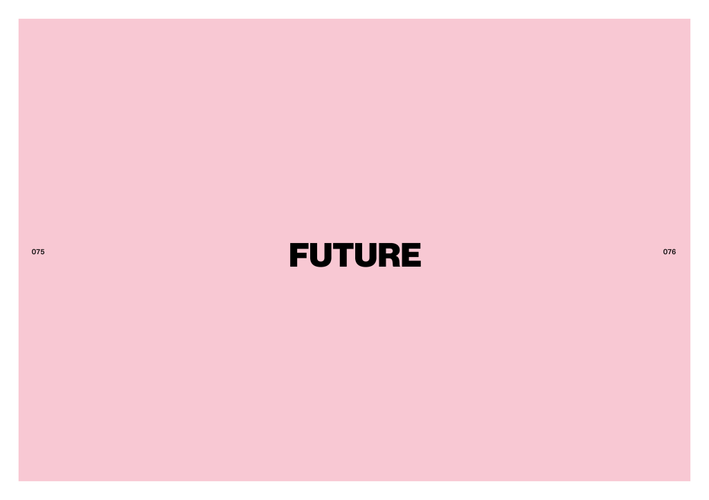
Looking at the style of the past in comparison to my designs for the present I was struggling to see the visual thread that was going to keep the book cohesive. Using colours that were so contrastingly different I think was a big part of this problem, I decided that using one and having different tones of it as the colour scheme would be much more suiting. I chose for the past to be the most vibrant and getting more diluted as it gets to the future, when navigating the book this will hoepfully give a sense of the industry diluting as time goes on.
I carried this colour style through to the Full and Sub chapter divides to make this transition apparent throughout the book. It is in unclear in these images but I also added a white border to the outside of these pages, this made the colours more a center piece to pay attention to, rather than just page furniture. I would of liked to keep the text white for consistency on the future but any colour theme I chose would always have legibility problems, hence having to go with black. This could however have positive connotations for the message, highlighting that the first to chapters set the scene while the future is the core message/prediction.
Previous VersionCurrent Version
In my most recent feedback it was highlighted that the quote page didn’t evoke the feeling of the past, I was trying to introduce it but having a modern picture and quote just didn’t make that transitition smooth. I was then introduced to the work of Ed Bernays after David suggested his relevance to the subject area. Looking deeper into his history I found so many great nuggets of influence on the field, I have since decided that there will be a few pages directly about the work of Ed Bernays later in this chapter. As I was looking for someone else to quote in my introduction it made sense to use Bernays as a way of forshadowing his inclusion. When building on the page further I tried gradient mapping him to a colour as opposed to the black & white I had been using before, using the chapter colour worked well at giving the page a sense of where you were in the book alongside the type weight, considering this I carried this out through the rest of the pages too, bringing in the pink wherever I would of used black in the present. The inclusion of the cats was my attempt at having the images interact further with the typographic elements. Although they don’t directly affect the text I don’t mind it, on reflection the rest of the book has a static ‘frozen in time’ feel to it with the imagery so playing into that with the more rigid style works in my favour.
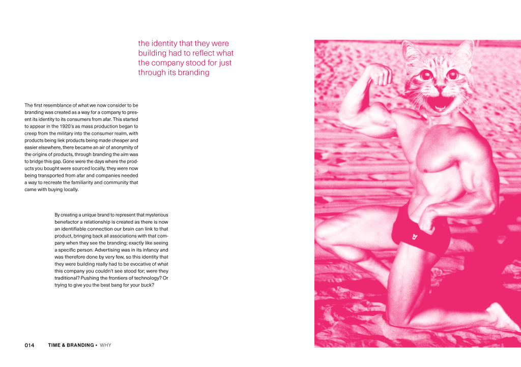
The imagery I chose here is a represenation of how brands had illustrate their values just through their appearance as there was no longer the direct contact that existed in traditional shopping. Keeping the link going with cats being sued as a anamorphic signifier when talking about brands. Similiar to the chapter headings I chose not to make the image full bleed for two reasons, because it gave it space to breathe and be more of a focus and also to make the chapter feel bit lighter, Having more negative space in this chapter would hopefully make the next feel heavier.
Previous Version
Following that vein of giving objects more room to breath I realised just how much significant history I was trying cram onto this page, it competely devalued the significane of how marketing mentally impacted branding. In order to account for this split it into three spreads, making it much more digestable while also giving me the opportunity to give more background through examples.
As each page gets closer to the future I used my varying colour themes to depict the gradual dillution.
I had a similiar problem here as with the chapter titles, ultimately I decided to still go with black for legibilty and to carry through with my previous style choice.
The way the page layouts worked out meant that the future was the odd number giving it its own page, this allowed the page rip idea to work alot smoother than the jarring single page that I had previously; I intend to still bring this missing page back later in the book.
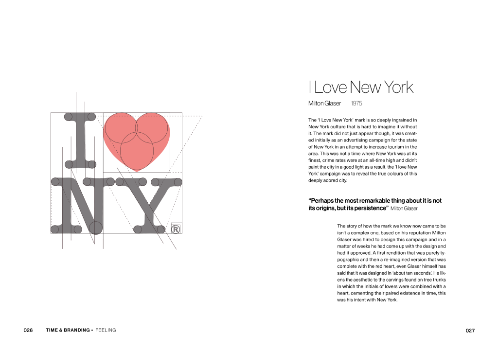
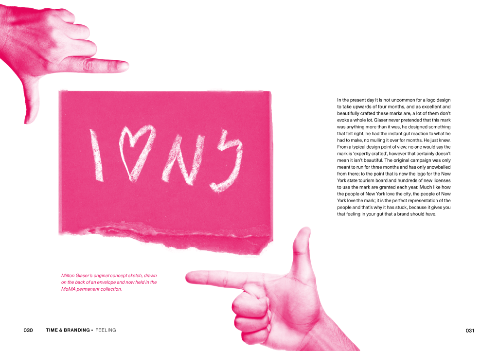
Since the last blog I have written my content for the parts on I LOVE NEW YORK, with the core message being about identities not necessarily being masterly crafted over months and thousands of pounds in order to evoke something great. A gut idea is a usually a good idea.
For the first spread I chose to play on the typical ‘design anatomy’ trend of disecting a logo into all of its elements in order to show this idea of perfect balance and craftsmanship. Yes may logos are made up of many perfect circles, but moslty it is an idea, the construction of it is secondary. I made sure to make the diagram satirical in the way that the lines do not actually create equilibirum incase it was misconstrude into looking like I was seriously deconstructing it.
An identity does not have to be geometrically perfect to be great.
The stylings of this page are designed to suggest a sense of gut vision of what an identity should be, I used the original sketch for the ILOVENEWYORK logo in order to further bring the idea to fruition of how it can come from humble beginings. This part of the chapter is meant to show a stark difference in design mentallity to some of more recent brands like Burberry.
Now that I have established a strong sense of chapter identity for both Past and Present I will now continue on my content for each to the point that each are fully realised and then begin putting that into design; allowing me to finish both chapters.
With easter break in its infancy my project for the break will mostly be to focus on creating this idea of a future of branding.
In order to get the ball rolling on the design process I decided to just get designing. My usual starting point for this would be to go on pinterest for inspiration but this time felt a little different. In a recent after life talk with Fiasco design we were advised that in order to create something new its best not to do this at the start of the project, and this time with me wanting it to representive of a personal response it felt right to base it all on my own inspiration. The font I chose is very different to what I would normally go for but I wanted to do something different than what I would typically do. In particular I liked letters like the ‘C’ and ‘E’ with their irregular slant.
For this draft I didn’t think too much about format as I knew that it would be abit of a grey area when it came to actually printing it with the state of unknown with the show, but I did know that I wanted it to be unbound pages. When looking at the artist books in the library this sort of format really stood out to me. I don’t have much a reasoning in the context of the idea fro the project but I think this is soemthing I can revisit later once I have a visual system developed. With the nature of unbound pages my solution to containing them would be to make some sort of catch and lock that will keep them together, giving the aesthetic of secrets being locked away, as if skeptics don’t want you to see the flaws in the logic. On the cover to reiteratate this I have placed the subtitle under the mockup of the locking mechanism, so that once it is unlocked it is revealed it is actually an essay against skepticism.
Example text based page
The text itself I have kept fairly contained for now in an attempt to not overwhelm with the big bold narrative pages that are dispersed throughout the book. As a system it alternates between question and answer everytime it changes chapter or moves on to a sub chapter, this is the only way that I could fit all of the narrative into the book. I considered giving each of these dividing pages more individuality but in the context of theme being a text style game, having them as they are is working well, it will just depend if the pacing works.
First narrative page – QuestionFirst narrative page – Answer
The colour pallette that I have chosen is meant to feel contrasting like the views of the skeptic and anti-skeptic, however I think that it could be used to better represent this within the text, but in order to do this I would need to cahnge the colours as yellow wouldn’t work by itself. So the colours are not set but I feel the current ones do show a sense of my intentions of it.
As well as the narrative pages I intend to do some more experimental quotation pages like this, as single unbound pages I think they could be rather appealing. They also lend them self nicely to using colour, even if I do end up changing the scheme.
As an initial reaction to the brief I think that my draft design fits the purpose but the visuals could have more ties to the concept itself through both colour systems and type systems, I invision this to be in the form of have a different look for the two sides of the view. An element I find works well so far is the narrative as it breaks up the text well and as it is in a contrasting tone to the body text it creates alot of intrigue of where it is going and what it means.
My next step wil be to submit it for feedback and repsond to that.