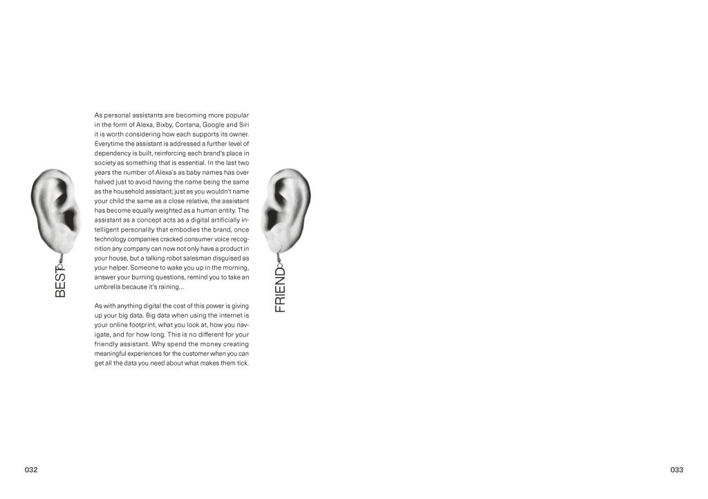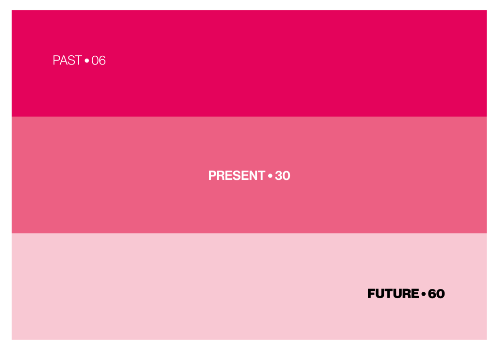
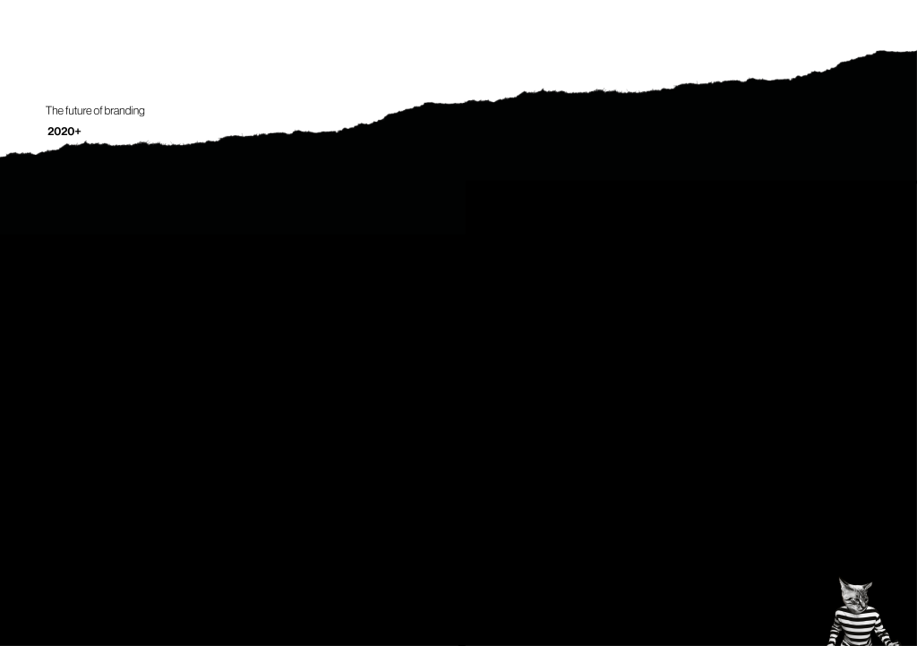
Looking at the style of the past in comparison to my designs for the present I was struggling to see the visual thread that was going to keep the book cohesive. Using colours that were so contrastingly different I think was a big part of this problem, I decided that using one and having different tones of it as the colour scheme would be much more suiting. I chose for the past to be the most vibrant and getting more diluted as it gets to the future, when navigating the book this will hoepfully give a sense of the industry diluting as time goes on.
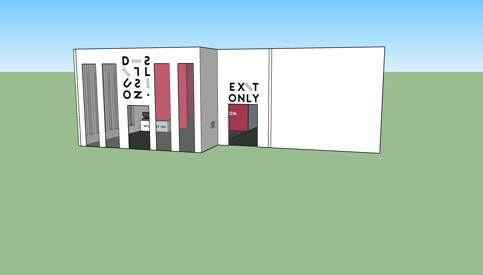
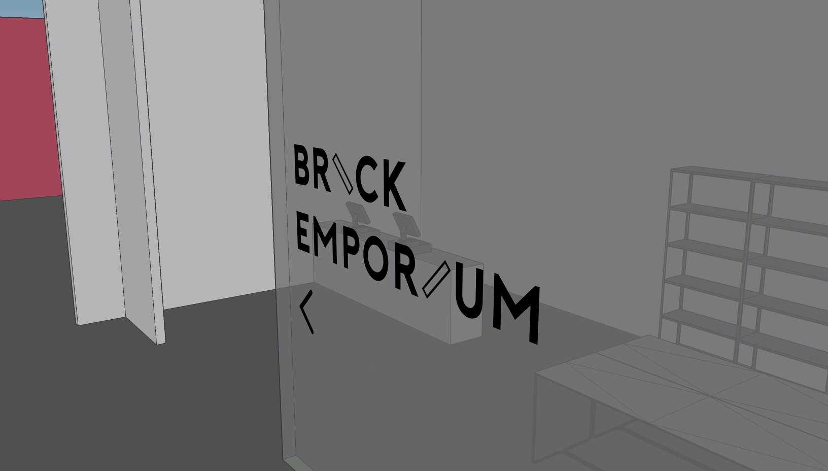
I carried this colour style through to the Full and Sub chapter divides to make this transition apparent throughout the book. It is in unclear in these images but I also added a white border to the outside of these pages, this made the colours more a center piece to pay attention to, rather than just page furniture. I would of liked to keep the text white for consistency on the future but any colour theme I chose would always have legibility problems, hence having to go with black. This could however have positive connotations for the message, highlighting that the first to chapters set the scene while the future is the core message/prediction.
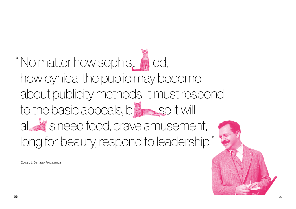
In my most recent feedback it was highlighted that the quote page didn’t evoke the feeling of the past, I was trying to introduce it but having a modern picture and quote just didn’t make that transitition smooth. I was then introduced to the work of Ed Bernays after David suggested his relevance to the subject area. Looking deeper into his history I found so many great nuggets of influence on the field, I have since decided that there will be a few pages directly about the work of Ed Bernays later in this chapter. As I was looking for someone else to quote in my introduction it made sense to use Bernays as a way of forshadowing his inclusion. When building on the page further I tried gradient mapping him to a colour as opposed to the black & white I had been using before, using the chapter colour worked well at giving the page a sense of where you were in the book alongside the type weight, considering this I carried this out through the rest of the pages too, bringing in the pink wherever I would of used black in the present. The inclusion of the cats was my attempt at having the images interact further with the typographic elements. Although they don’t directly affect the text I don’t mind it, on reflection the rest of the book has a static ‘frozen in time’ feel to it with the imagery so playing into that with the more rigid style works in my favour.
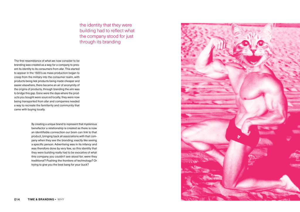
The imagery I chose here is a represenation of how brands had illustrate their values just through their appearance as there was no longer the direct contact that existed in traditional shopping. Keeping the link going with cats being sued as a anamorphic signifier when talking about brands. Similiar to the chapter headings I chose not to make the image full bleed for two reasons, because it gave it space to breathe and be more of a focus and also to make the chapter feel bit lighter, Having more negative space in this chapter would hopefully make the next feel heavier.
Following that vein of giving objects more room to breath I realised just how much significant history I was trying cram onto this page, it competely devalued the significane of how marketing mentally impacted branding. In order to account for this split it into three spreads, making it much more digestable while also giving me the opportunity to give more background through examples.

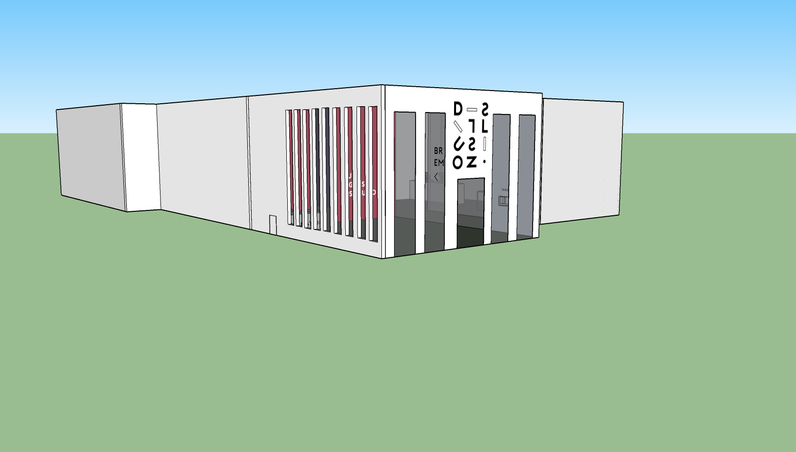
As each page gets closer to the future I used my varying colour themes to depict the gradual dillution.
I had a similiar problem here as with the chapter titles, ultimately I decided to still go with black for legibilty and to carry through with my previous style choice.
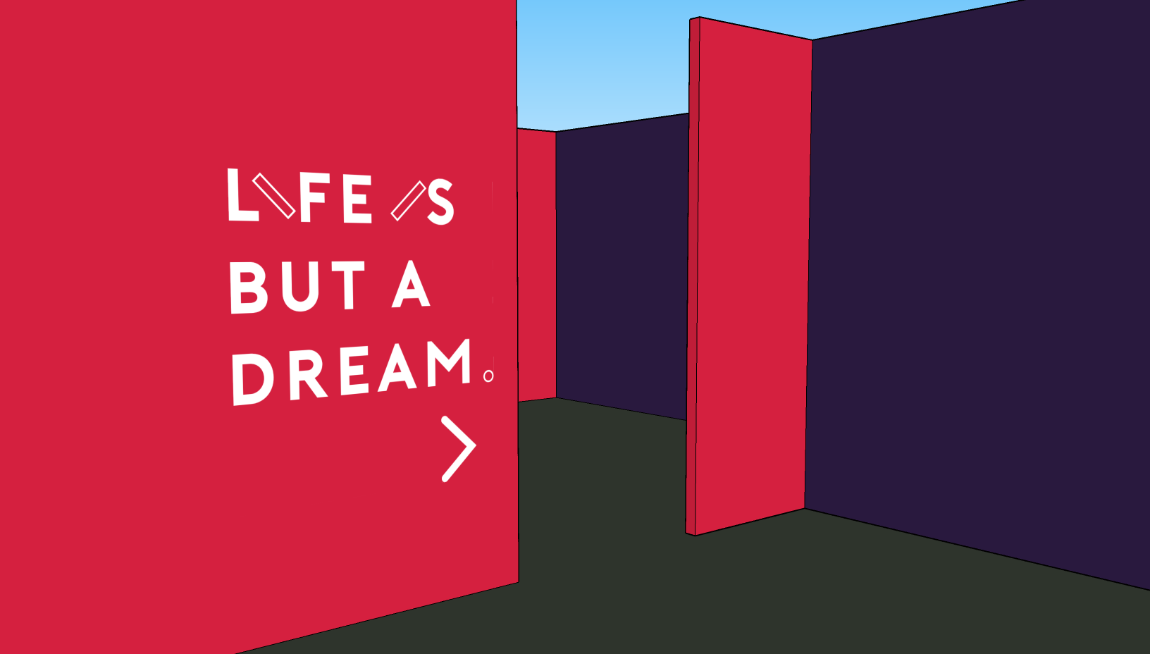
The way the page layouts worked out meant that the future was the odd number giving it its own page, this allowed the page rip idea to work alot smoother than the jarring single page that I had previously; I intend to still bring this missing page back later in the book.
Since the last blog I have written my content for the parts on I LOVE NEW YORK, with the core message being about identities not necessarily being masterly crafted over months and thousands of pounds in order to evoke something great. A gut idea is a usually a good idea.
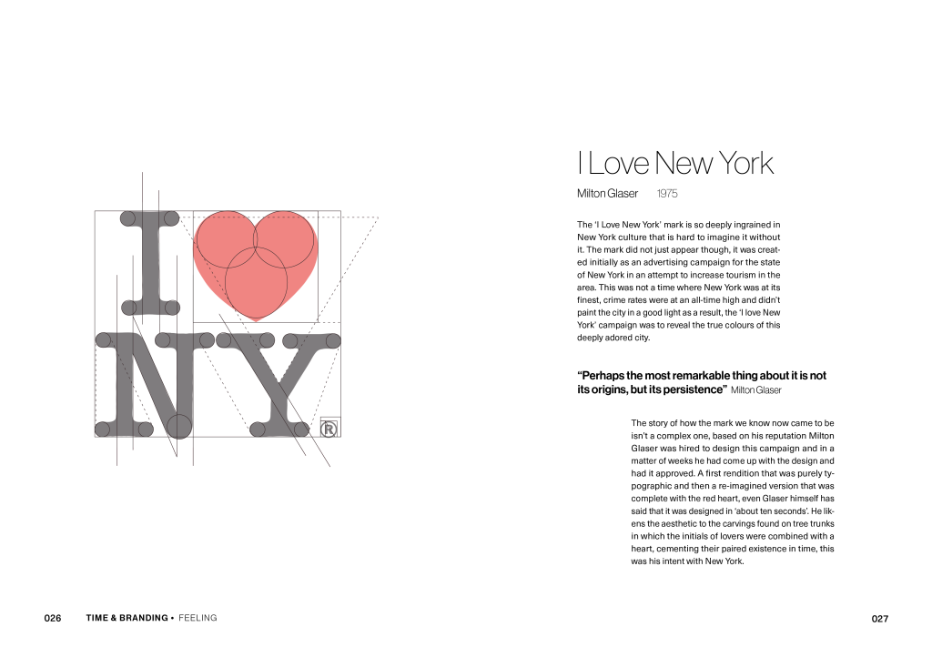
For the first spread I chose to play on the typical ‘design anatomy’ trend of disecting a logo into all of its elements in order to show this idea of perfect balance and craftsmanship. Yes may logos are made up of many perfect circles, but moslty it is an idea, the construction of it is secondary. I made sure to make the diagram satirical in the way that the lines do not actually create equilibirum incase it was misconstrude into looking like I was seriously deconstructing it.
An identity does not have to be geometrically perfect to be great.
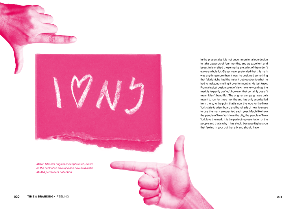
The stylings of this page are designed to suggest a sense of gut vision of what an identity should be, I used the original sketch for the ILOVENEWYORK logo in order to further bring the idea to fruition of how it can come from humble beginings. This part of the chapter is meant to show a stark difference in design mentallity to some of more recent brands like Burberry.
Now that I have established a strong sense of chapter identity for both Past and Present I will now continue on my content for each to the point that each are fully realised and then begin putting that into design; allowing me to finish both chapters.
With easter break in its infancy my project for the break will mostly be to focus on creating this idea of a future of branding.